



A reprint is the most expensive way to learn a color lesson. When a bag order arrives with a logo that looks right on screen but wrong on fabric, the cause is almost always a color specification that crossed systems: a brand file in RGB, a printer running CMYK, and a fabric decoration method that only Pantone can anchor. This guide explains the three color systems, where each one applies in bag production, and how to write a color spec that prevents reprints.

The Three Systems in One Sentence Each
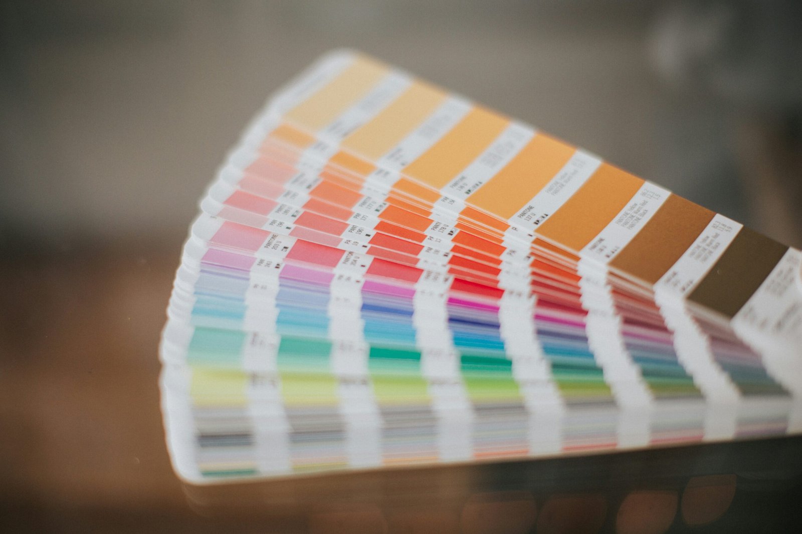
RGB is a light-based system for screens, where colors are built by adding red, green, and blue light. CMYK is an ink-based system for print, where cyan, magenta, yellow, and black inks subtract light from white paper. Pantone is a standardized library of pre-mixed spot colors, each with a physical swatch and a number, designed so a printer anywhere can reproduce the same color by mixing the same formula. The systems do not convert cleanly into each other, and the conversion losses are where reprints are born.
How Bag Decoration Methods Read Color Differently
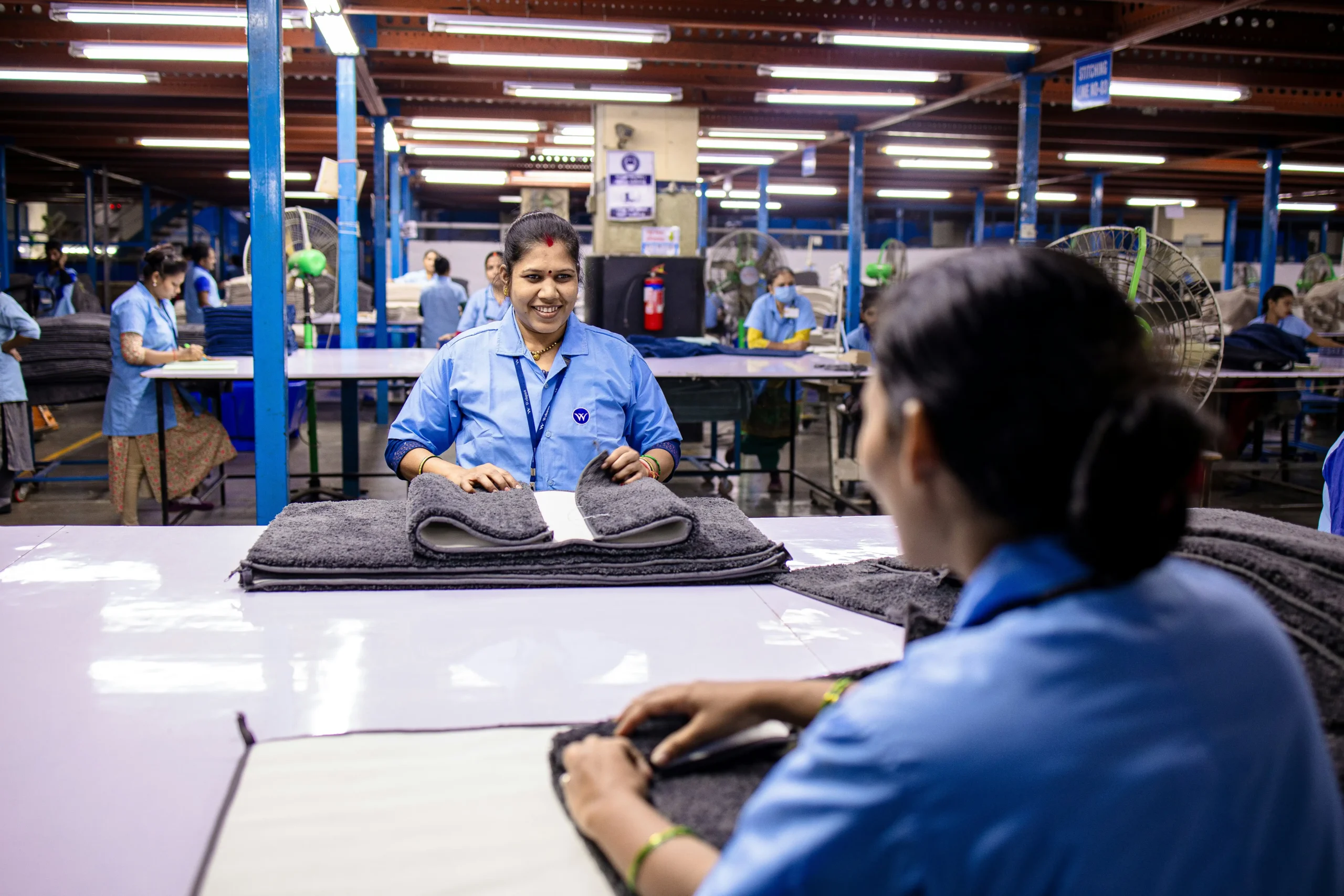
Bag decoration splits into two families with different color physics. Screen printing lays spot-color ink onto the fabric, which is exactly what the Pantone system was built for: the printer mixes the Pantone formula and the color lands close to the swatch. Digital and full-color transfer printing build the image from CMYK dots, which handles photographs and gradients but cannot hit many saturated Pantone colors at all, because CMYK’s gamut is smaller. Woven and jacquard methods go further still: the color comes from dyed yarns, so the spec must be matched against a yarn card, not a printed swatch.
The Spec That Prevents Reprints
A reprint-proof color spec names the color in the system the production method actually uses: a Pantone number for screen-printed logos, a CMYK breakdown for digital and transfer printing, and an RGB or hex value only as a reference for on-screen approval, never as the production anchor. It also states the tolerance rule (a Delta E limit of 1.5 to 2.5 between the swatch and the production sample is common), and it requires a physical pre-production sample signed off before bulk. Buyers should attach a Pantone swatch book reference rather than a screenshot, because screens lie about color.
What Buyers Should Ask the Factory Before the PO
Before the purchase order, ask the factory three questions: which color system their production method anchors to, whether they hold a current Pantone formula guide for the edition you are specifying, and what their internal tolerance check is between the signed sample and the bulk run. A factory that answers ‘we will match the artwork’ without naming a system is describing a hope, not a process. The signed physical sample remains the contract: if the bulk run drifts from it, the sample is what the reprint claim rests on.
Frequently Asked Questions
Should bag logos be specified in Pantone or CMYK?
Screen-printed logos should carry a Pantone number, because screen printing uses spot inks. Digital and transfer printing need a CMYK breakdown, and RGB is only a screen reference, never a production anchor.
Why do bag colors look different from the screen mockup?
Screens display color in RGB light while fabric printing uses CMYK inks, spot inks, or dyed yarns, all of which have smaller or shifted gamuts. A physical signed sample is the only reliable color reference.
What is a normal color tolerance for bag production?
A Delta E tolerance of 1.5 to 2.5 between the approved swatch and the production sample is common, with the signed pre-production sample as the contractual reference for the bulk run.
You May Also Like…
- Custom Bag Hang Tags and Inserts
- Prop 65 Compliance for Printed Bags
- Amazon FBA Prep for Moving Bags
Request a Landed Cost Quote
Planning a bag program for your market? Contact our team with your specification and volume, and we will return a landed-cost quotation with the documentation your customs authority requires.
Related reading: How Many Colors Can You Print on a Tote Bag? Color Count and Cost.
The grading scales and acceptance thresholds are explained in our color fastness testing guide.
IP basics for protecting a logo in overseas bag orders are in our protecting your logo overseas guide.
Print route economics decide tote program budgets; our screen printing versus digital printing guide prices both routes honestly.




0 Comments