


custom retail packaging specs is the first checkpoint buyers should lock before they approve a supplier, budget, or production slot. Talk to a merchandiser who has just opened a shipment of 3,000 luxury tote bags and found the brand’s signature navy looking more like a washed-out denim. The conversation shifts fast from marketing strategy to damage control. That panic almost always traces back to a missing line in the custom retail packaging specs sheet — something as small as referencing Pantone Uncoated instead of Coated. The difference is a 30–40% perceived color vibrancy shift on fabric. No one catches it during the design review because the screen looks flawless. The bag doesn’t lie, though.
Even when the PMS callout is right, the material still has a vote. Canvas absorbs up to 60% more ink than coated non-woven. Without a 10–15% ink volume reduction baked into the artwork profile, edges bleed and density goes muddy. Factories that don’t calibrate per substrate will run the same profile across cotton, canvas, and poly — and the batch variation will be visible to anyone unboxing the product. A spec sheet that includes substrate-specific calibration notes, a 3mm bleed with 5mm safe zone from seams, and a documented 5% QC sample hold cuts that risk before production starts. Luxury brands that mandate the QC hold reduce post-delivery defect claims by roughly 70%, because the factory knows 5% of the run will be pulled and inspected against the signed-off drawdown.

Material-Linked Print Techniques for Premium Bags
The bag’s material dictates the decoration method—ignore that, and you buy a defective run.
Screen printing still dominates premium canvas and heavy cotton because it lays down a thick, mechanically bonded ink film. On these absorbent substrates, fabric takes up to 60% more ink than coated non-woven. A factory that fails to compensate with a 10–15% ink volume reduction in the artwork profile produces a bleeding, fuzzy logo. Conversely, digital heat transfer excels on coated non-woven and laminated surfaces where the polymer coating creates a smooth anchor point. On uncoated cotton, heat transfer risks edge peeling after 10–15 wash cycles—a failure mode that kills brand perception in high-touch retail totes.
- Ink absorption delta: Canvas consumes up to 60% more ink than coated non-woven. Paper-layout profiles without that volume pullback guarantee edge blur.
- Screen minimums: 1,000 units is the typical economic floor. Digital heat transfer opens MOQ flexibility down to 200–500 pieces, but unit costs climb 30–40% on larger runs.
- Stretch distortion: Woven cotton requires a 1% lateral stretch compensation in the screen frame, plus 3mm bleed with 5mm safe zone from seams, otherwise the logo warps after filling.
- Foil adhesion checklist: Test on the exact material lot. Humidity during storage above 60% RH can oxidize foil edges within 3 months. Always request a scratch-test video on the pre-production sample.
- Die depth tolerance: Embossing/debossing depth should stay at 0.3–0.5mm on canvas to avoid tearing the fabric grain. Anything deeper and the bag becomes a tensile weak point.
- Setup fee waterfall: Single-pass screen+foil on orders over 2,000 typically consolidates into one setup cost. Separate runs double the pre-press bill.
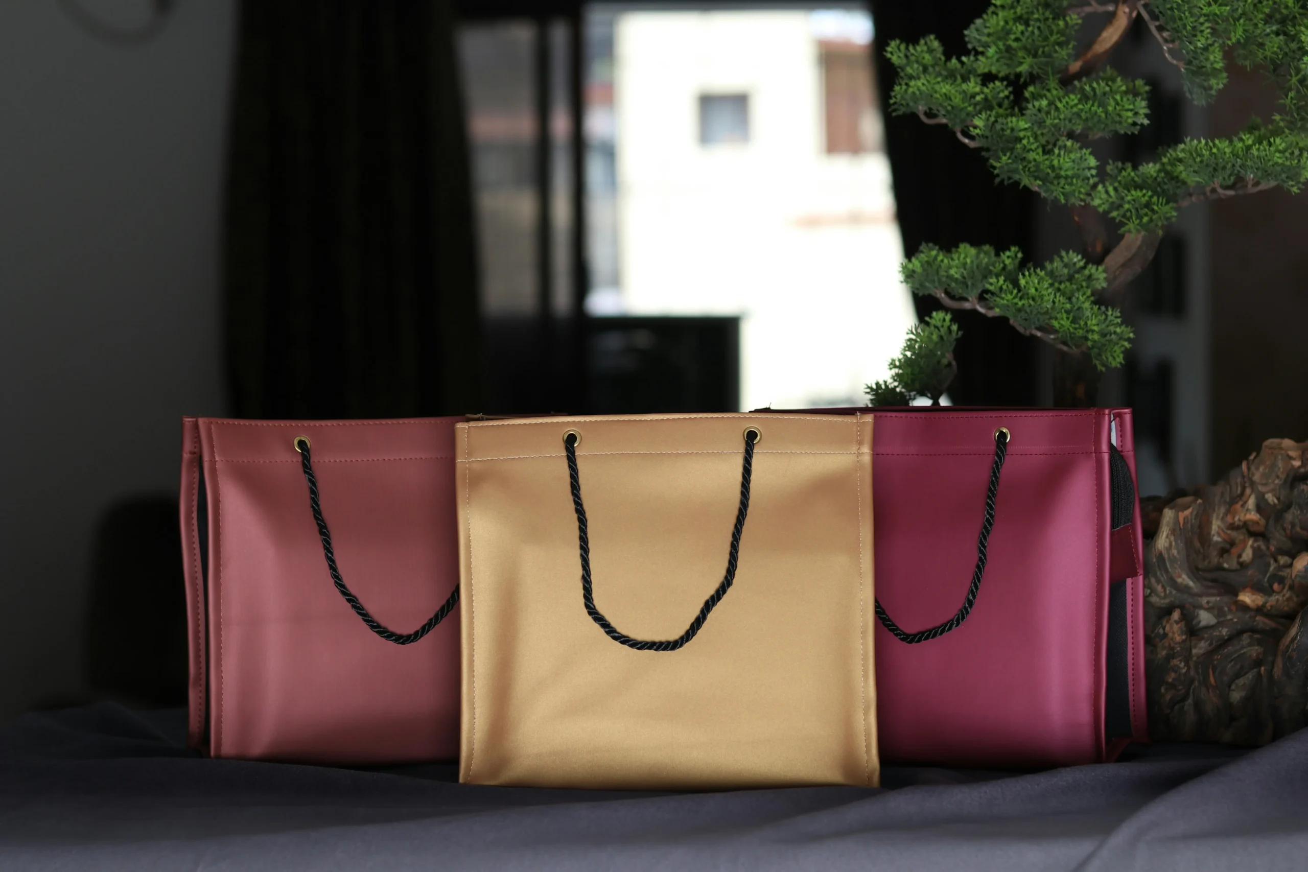
Foil stamping, embossing, and debossing add tactile prestige, but only if the base material can take the pressure without crushing. Heavy canvas and structured non-woven hold a clean deboss; lightweight polypropylene collapses under the die and leaves a half-formed impression. For foil, color specification trips up most first-timers. A factory’s named foil palette is the only reference that matters—PMS numbers are useless for metallics. If the brand color sits outside the standard palette, send a physical swatch. Expect to pay an additional $80–150 for a custom foil die, waived on orders above 2,000 units.
Where direct-factory production changes the economics is single-pass screen plus foil blocking. Domestic decorators typically run screen and foil as separate setups, each with its own screen fee, setup charge, and labor line. A factory that combines them in one pass on the same machine eliminates redundant setup costs, saving $0.15–$0.40 per unit on 2,000+ pieces. That spread alone can turn a borderline seasonal budget into a viable launch.
| Technique | Material Compatibility | Critical Spec Adjustment | MOQ & Cost Factor | Quality Outcome |
|---|---|---|---|---|
| Screen Printing (Single-Pass + Foil Option) | Heavy canvas, woven cotton | Reduce ink volume 10–15% (canvas absorbs 60% more ink); always reference Pantone C for vibrancy | MOQ 1,000+; single-pass with foil saves $0.15–$0.40/unit at 2,000+ | High color density, sharp edges; eliminates separate setup fees |
| Цифровой теплообмен | Coated non‑woven, smooth poly blends | Use CMYK or Pantone U; no bleed risk on low‑absorbent surfaces | MOQ 200–500; ideal for seasonal launches and small batches | Photorealistic detail, consistent tone across batches; risk of peeling on rough textures |
| Foil Stamping (Hot/Cold) | Smooth non‑woven, laminated weaves | Reference factory’s foil palette; custom foils require a physical swatch, never PMS | Often paired with screen in a single pass; cost‑effective above 2,000 units | Metallic brilliance, zero color shift across production, premium unboxing appeal |
| Embossing & Debossing | Thick canvas, faux leather, heavy non‑woven | Supply 3D die file; apply 1% lateral stretch compensation on woven cotton | Higher setup cost; reserved for permanent luxury collections | Tactile depth, no ink‑related variation, logo warping prevented |
Color Management & Proofing for Brand Consistency
A Pantone number alone guarantees nothing without the substrate profile.
Two color systems dominate packaging specs: PMS (Pantone Matching System) for spot colors and CMYK for four-color process work. On fabric bags, the choice is not philosophical. It determines whether your brand’s signature red looks bold or washed out. For solid logos, typography, and brand lock-ups, PMS is non-negotiable. CMYK blends cyan, magenta, yellow, and black dots to simulate hues; it cannot reproduce a true spot color and shifts noticeably from batch to batch. Reserve CMYK strictly for photographic imagery with gradients, and even then, insist on a drawdown proof to verify the composite color on your actual material.
- PMS Coated vs. Uncoated: Specifying Pantone U (uncoated) on a fabric tote causes a 30–40% perceived drop in vibrancy compared to Pantone C (coated). Fabric substrates arrest ink like a coated sheet, not like porous offset paper. Always reference Pantone C, and ask for a proof on the production material to confirm optical density.
- Ink reduction for woven materials: Canvas and cotton absorb up to 60% more ink than coated non-woven polypropylene. Without a 10–15% ink volume reduction in the art file profile, fine lines bleed, and solid fills turn muddy. This calibration is substrate-specific and must be applied at the pre-press stage, not on press.
- Lateral stretch compensation: Woven cotton stretches laterally by roughly 1% during printing and finishing. If the artwork does not compensate, logos elongate or distort near seams. A 1% scale-back on the horizontal axis preserves the original proportions, especially when paired with a 3mm bleed and 5mm safe zone from stitch lines.
Non-woven bags present a different calibration challenge. Their coated surface provides a more predictable ink holdout, so color targets can be tighter. However, the heat-transfer lamination often used on non-woven bags can shift the color temperature of underlying prints by 2–3 ΔE if the film carries a yellow or blue cast. Pre-production samples must include the final laminated side, not just a raw printed swatch, to avoid a costly mismatch when the first 1,000 units arrive with a tint you did not approve.
The gap between a Pantone fan deck held under office lighting and a fabric bag seen under retail display illumination is where most merchandisers lose control. Fabric texture diffuses light; a glossy ink standard becomes semi-matte on canvas. Direct-factory calibration with spectrophotometer readings across multiple material cut-offs is the only way to keep ΔE under 1.5 across production batches. When the spec sheet reads “Pantone 186 C” for a cotton tote, the press operator must refer to an ink formula adjusted for that specific substrate’s absorption curve—not a generic mixing guide.

Preparing Artwork & Dielines
3mm bleed, 5mm safe zone, 1% stretch compensation—get these wrong, and your branding warps.
A dieline is not a suggestion. It defines the physical cut, fold, and stitch lines of the bag. When artwork ignores seam allowance or fabric stretch, the result is a logo bisected by a hem or distorted across the body of the tote. Every retail brand merchandiser needs to lock down three critical tolerances before finalizing artwork: bleed beyond the dieline, safe distance from seams, and material-specific stretch compensation.
- Bleed: Extend all graphics 3mm beyond the trim line. This prevents white edges if the fabric shifts during cutting. For coated non-woven, standard bleed suffices. For canvas, the higher ink absorption demands a profile-adjusted 10–15% ink reduction to avoid bleeding into stitch areas.
- Safe Zone from Seams: Keep critical elements (logos, text) at least 5mm inside the seam line. Seam allowances on luxury totes fold over and get stitched through, destroying any graphic that rides the edge. A 5mm buffer is the minimum; on heavy canvas, increase to 7mm if the seam is double-stitched.
- Lateral Stretch Compensation: Woven cotton stretches laterally during printing and handling. Specify a 1% stretch compensation in the dieline notes. Without it, the printed width will compress slightly relative to the bag, distorting a circular logo into an oval. The factory does the compensation, but you must call it out in the spec sheet to avoid surprise.
- Vector Artwork: AI or EPS, with all type outlined and layers flattened. Clean paths, no stray points. This ensures scalability and sharp edges for screen printing or foil stamping. Minimum stroke weight 1pt to survive fabric texture.
- Raster Images: 300 DPI at final print size. TIFF preferred over PNG; avoid JPEG compression artifacts. For halftone effects, use a PDF/X-1a with embedded profiles. The dieline must be on a separate layer labeled ‘Dieline’.
- Color Mode: Submit in CMYK or Pantone references, never RGB. For fabric, Pantone C is the baseline—using U shifts vibrancy by 30–40%. The factory will adjust profiles for the specific material, but your file must start from the correct swatch.
File format is where most first-time merchandisers trip. Submitting a low-resolution JPEG extracted from a PowerPoint slide all but guarantees a pixelated luxury unboxing experience. The only acceptable source files for production are vector (AI, EPS, or outlined PDF) for logos and type, and high-resolution raster (300 DPI TIFF or PSD) for photographic elements. Convert all fonts to outlines. Embed color profiles in the file, but never assume the factory will adjust them—verify during the pre-production sample.
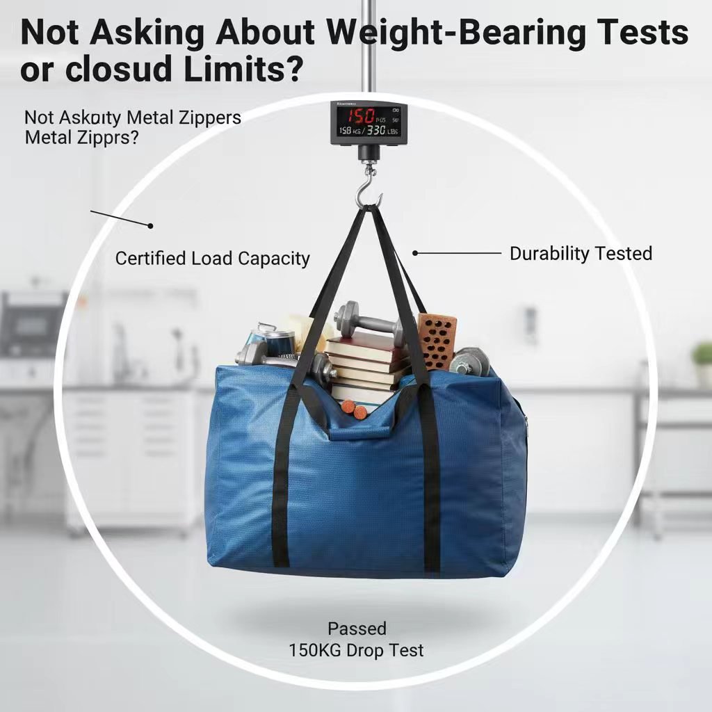
Pre‑Production QC & Sample Approval
A 5% QC sample hold reduces post-delivery defect claims by up to 70%.
Pre-production QC is not a formality. It is the only checkpoint that prevents 5,000 units arriving with a logo shifted 4mm left of center. Most print defects trace back to one gap: no physical sample was signed off on the exact production material.
The sample approval stage locks three variables that digital proofs cannot resolve — ink absorption on the substrate, stitch interaction with the print area, and foil adhesion under tension. A PDF mockup on a calibrated monitor tells you nothing about how Pantone 186 C renders on 12oz cotton canvas.
- Material-Specific Drawdowns: Always request a physical drawdown on the production fabric, not a generic paper proof. Canvas absorbs up to 60% more ink than coated non-woven. An artwork profile calibrated for non-woven will bleed and lose edge definition when printed on canvas unless ink volume is reduced by 10–15%.
- Pantone Coated vs. Uncoated Trap: Referencing Pantone U (uncoated) swatches for fabric bags creates a 30–40% perceived vibrancy drop versus Pantone C (coated). Fabric lacks the brightening agents in coated paper. Specify Pantone C references and set the acceptance tolerance at ±1 ΔE. Anything wider and batch-to-batch drift becomes visible on shelf.
- Seam Allowance and Stretch Compensation: Woven cotton stretches laterally during printing and sewing. A 3mm bleed with a 5mm safe zone from seam lines is the minimum. Add 1% lateral stretch compensation to the art file dimensions. Without it, circular logos become ovals after the gusset seam is stitched.
- Single-Pass Decoration Verification: If the spec calls for screen printing plus foil blocking, confirm the factory runs both in a single pass. Separate setups add $0.15–$0.40 per unit on orders above 2,000 units. Direct-factory suppliers can combine them on one machine; contract decorators typically cannot and will bill for two setups.
- Digital Proof Alone: Digital proofs show alignment but not color fidelity on fabric. They miss ink absorption, gloss level, and foil reflectivity entirely.
- Skipping the Pantone C Reference: Leaving the color standard unspecified defaults to the printer’s interpretation. The result is a 30–40% vibrancy gap that cannot be disputed without a written reference.
- Approving Without Stretch Compensation: Art files built at exact finished dimensions will distort. The 1% lateral compensation on woven cotton is non-negotiable once cutting dies are made.
- No Overrun Clause: Rejecting 3% of a batch leaves you 3% short. A 2% overrun built into the contract absorbs QC fallout without delaying distribution.
The standard luxury packaging contract includes a 5% QC sample hold. The factory retains 5% of the production run for 14 days after shipment. If a defect pattern emerges in the delivered batch, these retained samples are cross-checked against the approved reference. A matching 2% overrun allowance prevents a minor QC rejection from leaving you short on a seasonal launch.
Sample approval timelines are rigid. A pre-production sample with complete specs takes 5–7 business days. Each correction round adds 3–5 days. Factoring two revision cycles means the approval gate consumes nearly three weeks. Begin sample approval before finalizing retail launch dates, not after.
Do not accept a sample printed on a substitute material. A non-woven sample cannot validate a canvas order. The ink strike-through, fiber show-through, and post-cure hand feel differ materially between substrates. Insist on the exact fabric weight, weave, and coating specified in the purchase order.
Common Print Specification Mistakes (and How to Avoid Them)
Most print failures are locked in before ink touches fabric.
Print defects rarely start on the production floor. They start in the spec sheet — or more precisely, in the gaps where critical parameters were left blank. A merchandiser who sends a logo file without material-specific calibration data is effectively asking the factory to guess. And when factories guess, brand consistency loses every time.
- Mistake 1: Referencing Pantone U (Uncoated) on fabric bags: Pantone U swatches are formulated for absorbent paper stock. Fabric bags — especially coated non-woven or laminated totes — behave more like a coated surface during printing. Referencing Pantone U forces the ink technician to overcompensate density, resulting in a 30–40% perceived color vibrancy shift. Always specify Pantone C (Coated) references and request a physical drawdown on the exact bag material before approving the run.
- Mistake 2: Ignoring the ink absorption gap between canvas and non-woven: Canvas fabric absorbs up to 60% more ink than coated non-woven. If the artwork profile is built for one material and applied to another without adjustment, color density shifts visibly — blues go flat, blacks turn muddy. The fix is a 10–15% ink volume reduction baked into the file profile when printing on canvas, plus a separate calibration proof for each material in the order.
- Mistake 3: Skipping stretch compensation on woven cotton: Woven cotton stretches laterally during screen printing, especially on manual carousel presses. Without a 1% lateral stretch compensation built into the dieline, logos distort near seams and gussets. Combined with a 3mm bleed and a 5mm safe zone from all stitch lines, this single spec line prevents the warped-logo problem that triggers rejection on arrival.
- Mistake 4: Neglecting the QC hold and overrun clause: Luxury brands that negotiate a 5% QC sample hold and a 2% overrun allowance reduce post-delivery defect claims by up to 70%. The hold forces the factory to pull random units mid-run for inspection rather than shipping everything unchecked. The overrun buffer means a few rejected units don’t kill the entire shipment count. Without these two numbers in the contract, the buyer absorbs 100% of batch variance.
- Mistake 5: Using PMS numbers to specify foil colors: Foil stamping does not use Pantone ink. Each foil manufacturer maintains a named color palette — rose gold, champagne, holographic silver — that does not map to PMS values. Sending ‘PMS 877 C’ for a foil color forces the factory into a translation exercise that rarely matches expectations. The correct process: request the factory’s foil swatch book, select by name, or ship a physical swatch for custom matching.
- Mistake 6: Leaving RFQ fields blank: Missing a single field — material weight, handle style, print location count — in a packaging RFQ adds 2–5 business days per clarification round. Three missing fields can push a seasonal launch window past the drop-dead date before the first proof is generated. Complete spec sheets are not bureaucratic overhead; they are the difference between a 7-day sample turnaround and a 3-week email chain.
A related failure: sending raster logos at 72 DPI when the screen mesh requires 300 DPI minimum. The result is a jagged edge that looks passable on a proof PDF but visibly degrades at full scale on fabric. Vector files — AI, EPS, or outlined PDF — eliminate this risk entirely for logos and text. Reserve raster formats for photographic elements only, and never below 300 DPI at final print dimensions.
The common thread across every mistake listed here is the assumption that the factory will figure it out. Factories can figure it out — but only when they have the parameters. Every blank field, every missing swatch, every absent tolerance is a decision delegated to someone who has never seen your brand guidelines. The spec sheet is the only document that travels from your desk to the press operator’s station. If the critical numbers aren’t on it, they aren’t in the final bag either.
| Распространенная ошибка | Причина | Prevention | Impact if Ignored |
|---|---|---|---|
| Specifying Pantone Uncoated (U) instead of Coated (C) on fabric bags | 30–40% perceived color vibrancy drop on absorbent fabric surfaces | Always reference Pantone C swatches; request a drawdown on actual material | Brand colors appear dull, inconsistent across batches |
| Ignoring material ink absorption rates | Canvas absorbs up to 60% more ink than coated non-woven, causing bleeding | Reduce ink volume 10–15% in artwork profile; calibrate per material | Blurred details, muddy visuals, rejected samples |
| Insufficient bleed, safe zones, and no stretch compensation | Fabric weaves stretch laterally during printing/filling | Include 3mm bleed, 5mm safe zone from seams, 1% lateral stretch offset | Crooked logos, cut-off text, warped brand assets |
| Omitting QC hold and overrun tolerance in contracts | Zero buffer for production variances halts timelines | Negotiate 5% QC sample hold and 2% overrun allowance in spec sheet | Up to 70% higher post-delivery defect claims |
| Not combining print/finish operations at a direct factory | Separate screen and foil stamping setups inflate unit costs | Specify single-pass screen + foil blocking at one integrated supplier | $0.15–$0.40 extra per unit, delayed delivery |
| Submitting artwork with wrong file formats or fonts | Raster logos with un-outlined text degrade during plate-making | Supply vector AI/EPS, 300 DPI PDF/TIFF, and always outline all fonts | Production holds, added art fees, missed launch windows |
Заключение
Print specs are the only firewall between a luxury brand and a shipment of bags that dilute it. A 3mm bleed error or a Pantone U swatch misreference can shift a seasonal launch from premium to discount-bin. Lock the dieline tolerance, the color drawdown, and the QC hold percentage into the contract before the first screen touches fabric. That discipline turns a packaging line item into a brand asset.
Compare factory samples against your spec sheet, not a digital mockup. If the material stretch isn’t compensated in the artwork, the logo walks. Direct-factory setups that run screen and foil in a single pass eliminate the separate setup charges that inflate unit cost on short runs.
Часто задаваемые вопросы
What file format is best for custom bag printing?
Vector AI or EPS for logos and text; use 300 DPI PDF or TIFF for raster images. Always outline fonts to avoid substitution. Outline fonts before sending artwork.
How do I specify foil stamping colors on luxury totes?
Use the factory’s named foil palette—PMS numbers are unreliable for metallic foils. For a custom shade, send a physical swatch. Physical swatches override digital color references.
What’s the minimum order quantity for custom printed retail packaging?
Digital print typically starts at 200–500 units; screen printing often requires 1,000+. Flexible tiers exist in the 300–3,000 range based on print complexity. Confirm MOQ after choosing the print method.
How long does sample approval take?
A pre‑production sample with complete specs takes 5–7 business days. Each correction round adds 3–5 days. Submit finalized artwork to avoid revision delays.
Can I match Pantone colors exactly on fabric bags?
Expect a ±1 ΔE tolerance, not an exact match. Use Pantone Coated references and request a drawdown on the exact fabric. Approve a physical drawdown before production.


0 комментариев