
Drawn from our screen, heat transfer and digital print lines, plus the Pantone matching we run on tote orders.
At the screen printing station, a three color frame sat waiting while a buyer flipped through her artwork sheet for the fourth time. She had one question, and she asked it before the sample bag was even pulled: how many colors can this tote actually hold? The answer depends on which ceiling she means, and the meeting moved through six of them before she signed anything.
The Question That Started the Sample Meeting

The artwork showed a logo with a solid red mark, a navy wordmark, and a thin gold rule underneath. On paper it read as three colors. On the table, next to a natural canvas tote, it read as a negotiation.
Her first assumption was that a tote bag takes as many colors as a printer can load. That assumption usually survives until the first quote comes back, because the color count drives cost in steps rather than in one jump. Each added color is another screen, another pass, and another chance for registration to drift on fabric.
The meeting settled into a rhythm: she asked, the sample room answered, and the artwork sheet changed in the margin. What follows is the order those questions came in, because the order matters when a launch date is already set.
Is There a Hard Ceiling on Colors Per Side?
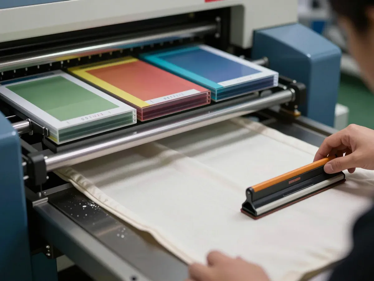
Technically, most printing methods handle multiple colors. Screen printing commonly runs one to six colors per side, and that range is where quality work on fabric stays stable. Beyond six, registration shifts become visible, especially on a soft substrate that moves under the screen.
So the technical maximum is not a wall at six. It is a point where the method stops being the right tool. A photographic or gradient design belongs on heat transfer or UV printing, which handle unlimited colors, including full color artwork. A logo with a handful of solid marks belongs on screen print at the exact color count it needs.
The ceiling a buyer should care about is the economic one. Screen printing costs in per color steps: each color adds a screen setup and a per unit pass charge. A six color screen job often costs more than a full color transfer of the same artwork, which surprises buyers who assume more screens means more value.
Why Does a Six Color Screen Job Cost More Than Full Color Transfer?

The screen route charges for repetition. Six colors means six frames, six pulls across the fabric, and six registration checks before the bag leaves the station. The transfer route charges for a single printed sheet applied once by a heat press.
That difference explains the quote gap on a busy design. A six color screen job carries six setup steps and six passes per unit, while a full color transfer carries one application. On short runs the screen route rarely wins on price. On long runs the per unit pass charge can still favor screen when the design is simple and the colors are few.
The buyer in the meeting had a five thousand piece run and a three color logo. Screen print was the honest route. Had her artwork carried a gradient behind the wordmark, the same run would have moved to transfer without debate.
Does a Dark Tote Bag Change the Count?

Her second sample was black. The same three color artwork went onto it, and the sample room added a white underbase before any of the brand colors went down. On dark fabric, that underbase is effectively another color in the count: a three color design on dark prints as four passes.
This is the detail buyers miss when they approve artwork on a white mockup and then switch the bag body to navy or black. The design did not change. The number of passes did, and so did the registration risk, because every color now sits on top of an opaque layer that has to be cured evenly.
Whether the underbase pays off depends on the artwork and the run size, not on a fixed rule. A bold logo on dark canvas usually needs it. A light, thin mark may read better as a single hit of a lighter ink, which changes the design conversation rather than the color count.
Can Heat Transfer Hit the Same Pantone as Screen Print?
Screen printing matches Pantone references per color, and a two color Pantone matched logo is the standard spec for brand work. The printed color sits directly on the fabric, so the reference holds closely across the run.
Heat transfer and UV print work in CMYK process colors, which match spot colors only approximately. A brand navy can come back slightly warmer or cooler than the Pantone chip, and the gap shows most on large solid areas. For a logo with a strict brand standard, that approximation is the tradeoff for unlimited color and photographic detail.
The practical split is straightforward. Solid brand marks with named Pantone references go to screen. Complex artwork with gradients, photos, or many tones goes to transfer, with the understanding that color is close rather than exact. Mixing the two methods on one bag is possible, and it is usually done when a brand wants a Pantone logo on one side and a photographic campaign image on the other.
What Should the Artwork Sheet Say Before Sampling?
By this point the buyer had stopped asking about maximums and started asking what to write down. The artwork sheet is where the color count gets fixed, and a vague sheet is what turns a three color approval into a five color argument at inspection.
The sheet should name the method, the number of colors per side, and the Pantone reference for each color. It should state the bag body color, because dark bodies add an underbase. It should mark print position and size, and it should note any second method used on the reverse side.
Minimum color count, method matched to artwork, Pantone references named, and a sample approved: with those four lines in place, the color spec protects both the brand and the budget. Without them, the count is a verbal agreement that nobody can check against a carton.
How Do You Check Color on the First Printed Sample?

The first printed sample is the only cheap moment to catch a color problem. Under the shop lights, compare the print against the Pantone chip, not against a screen image of the logo. Screen images shift with every monitor.
Check registration at the edges where two colors meet, because that is where drift shows first on fabric. Look at the underbase on a dark body to confirm it is opaque and evenly cured. Then wash one sample if the program allows it, since a color that fades after a few cycles was never matched in the first place.
Every order the factory runs passes four checkpoints, and the printed sample review is where the color count stops being a number on a sheet and becomes a physical reference. Keep that approved sample sealed. It is the standard the production run gets measured against.
The Question Buyers Ask After the Sample Is Approved
The buyer signed the sample, then asked the question that should have come first: what happens if the count changes later? A color added after approval means a new screen, a new pass, and a new sample, and on a tight schedule that change can move a launch date.
The reverse is just as costly. Dropping a color after screens are shot leaves setup already spent and the artwork sheet out of step with the bag. Both directions turn a settled spec into a renegotiation.
Color count belongs in the order confirmation, not in the sample meeting notes. Lock the method, the per side count, the Pantone list, and the body color before the purchase order goes out. A buyer who fixes those four lines early spends the sample meeting confirming a decision instead of discovering one.
FAQ
Can the buyer mix screen printing and heat transfer on the same tote bag?
Yes. A common split is a Pantone matched screen print on the front and a full color transfer on the back. The artwork sheet should name both methods and the color count for each side.
Does embroidery count toward the color number?
Embroidery is a separate decoration route, not a screen pass. An embroidery machine stitches a monogram in one thread color at a time, so thread colors are specified separately from the print count.
How many colors can a woven label carry?
Woven labels are a branding option alongside screen print and retail packing, and their color capacity depends on the loom and the label design. Specify the label colors on their own line rather than folding them into the print count.
What happens if the Pantone reference is not named on the artwork sheet?
The printer matches to the nearest available ink or to a visual approximation. That is how a brand navy comes back slightly off, and how a color dispute starts at inspection with no reference to settle it.